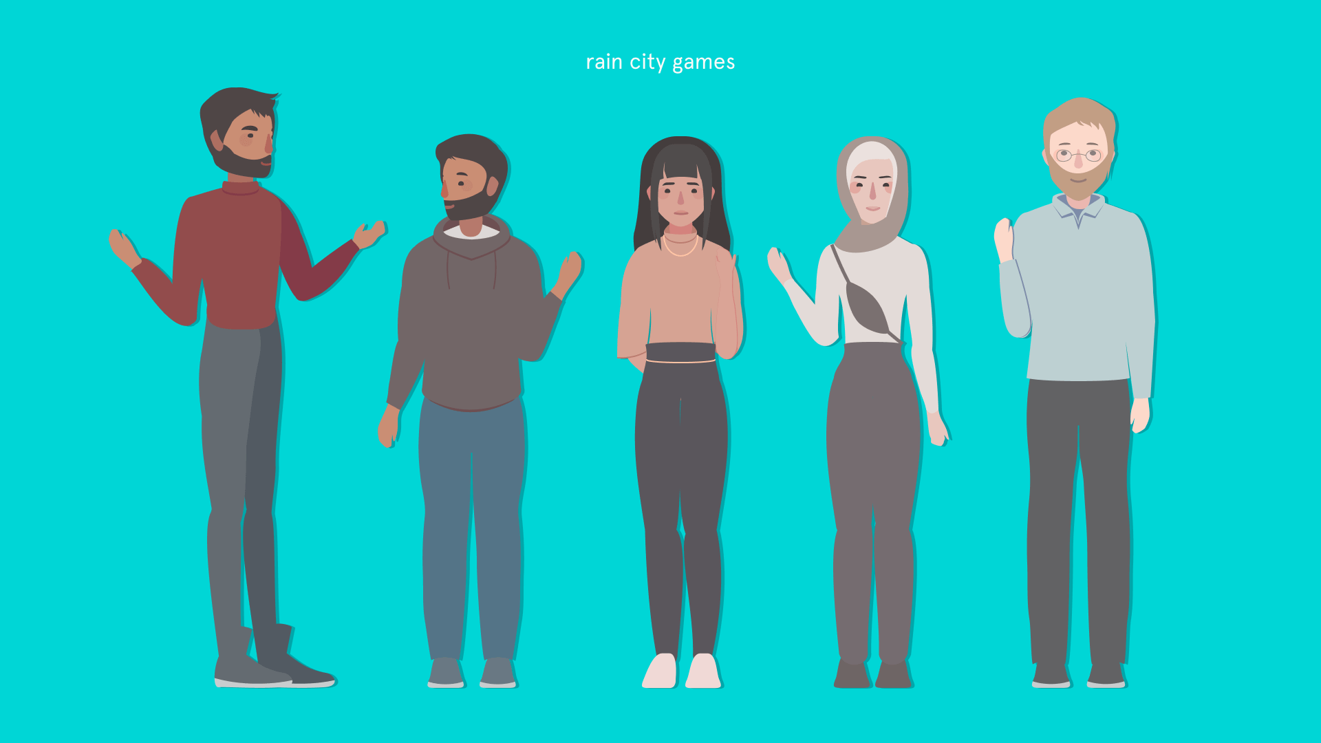
choose your own adventure
Rain City Games
Visual Design
figma × illustrator

Overview
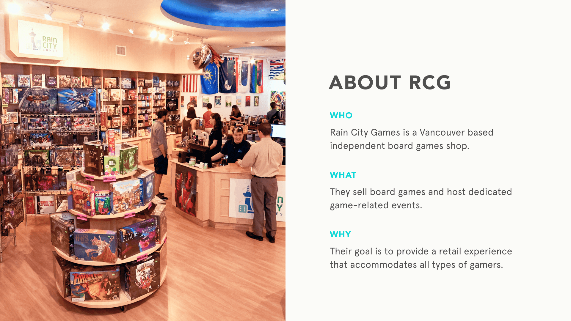
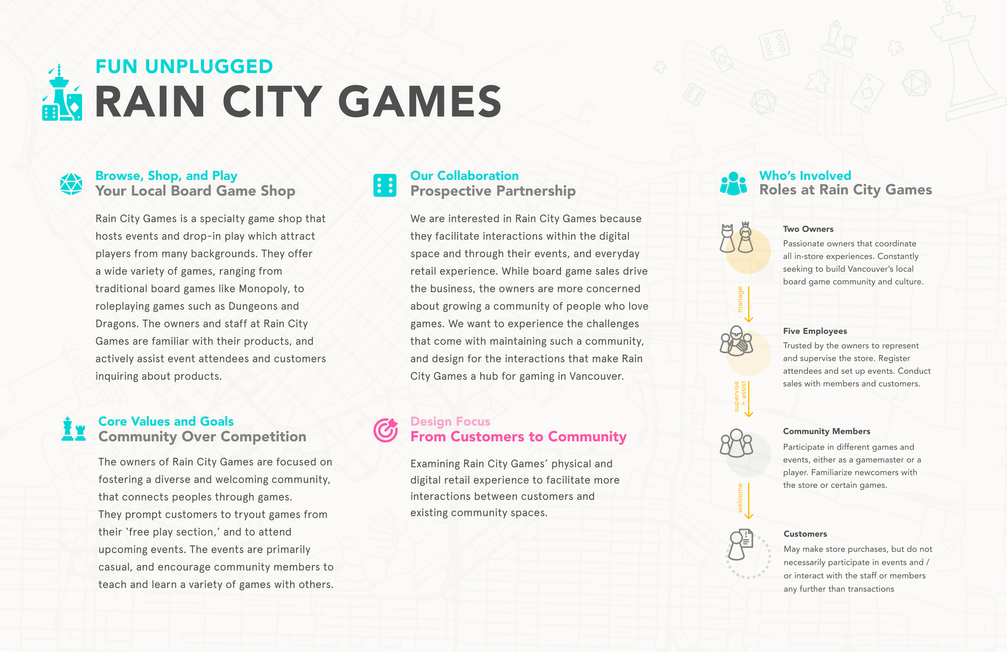
"Choose Your Own Adventure" is a 13-week interaction design project produced alongside Rain City Games, a specialty board game shop located in Vancouver.
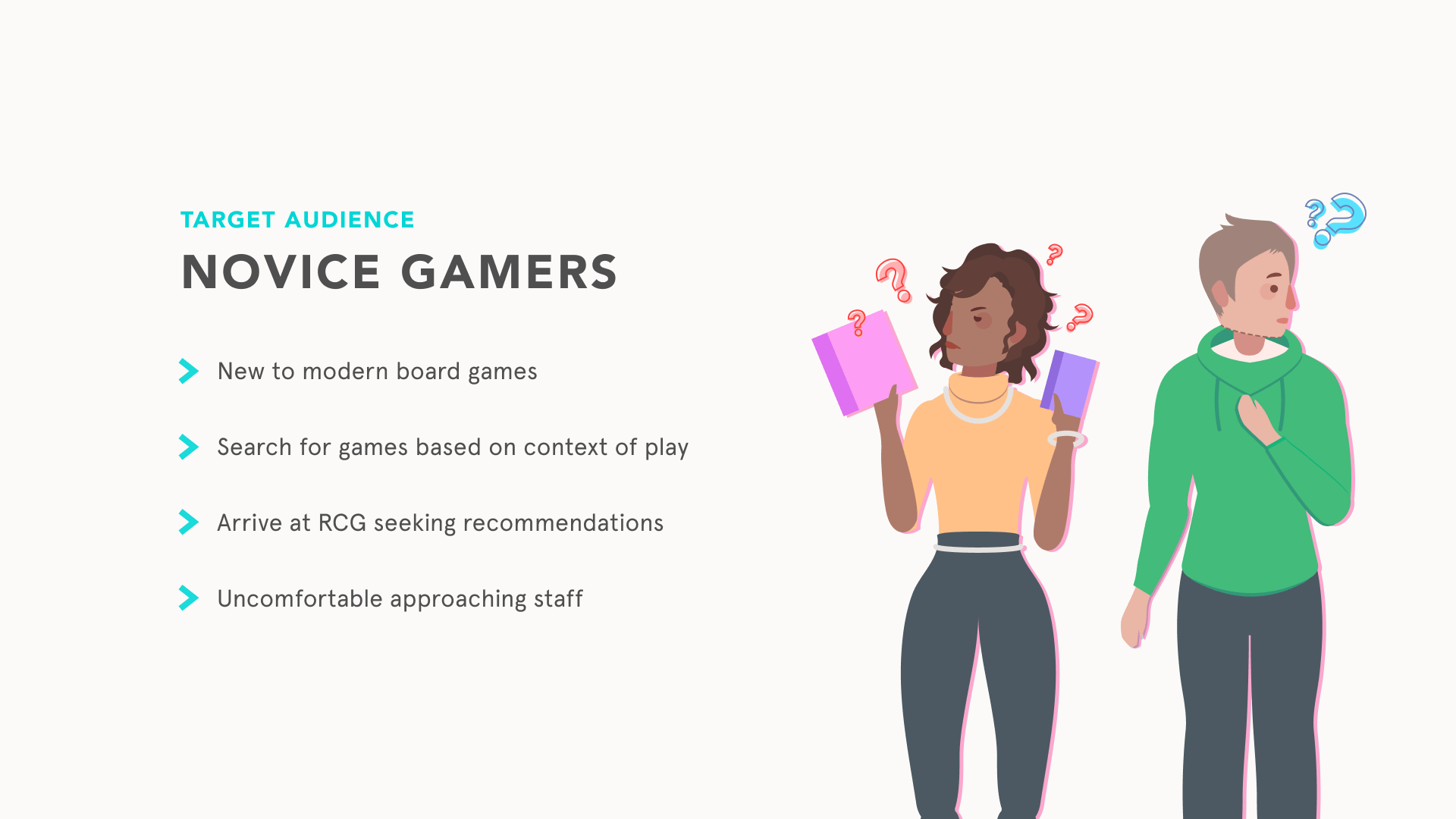
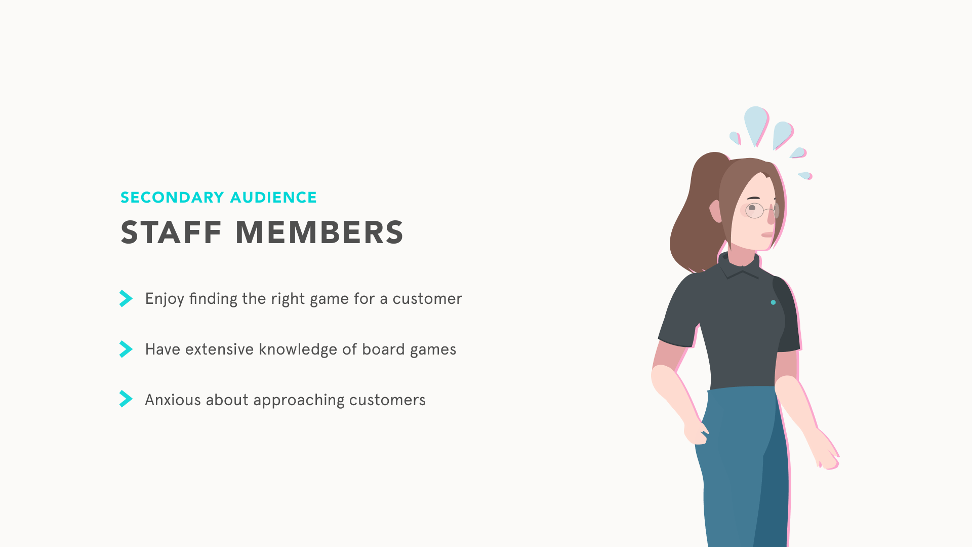
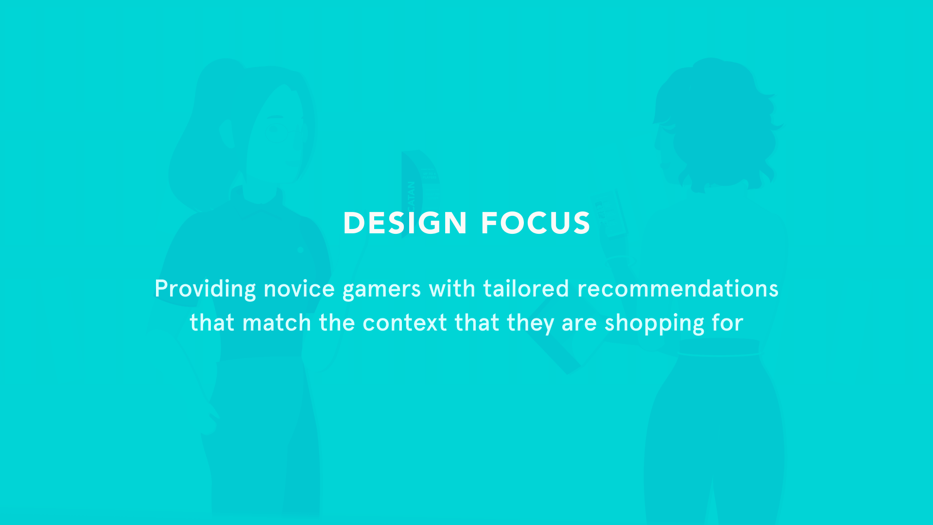
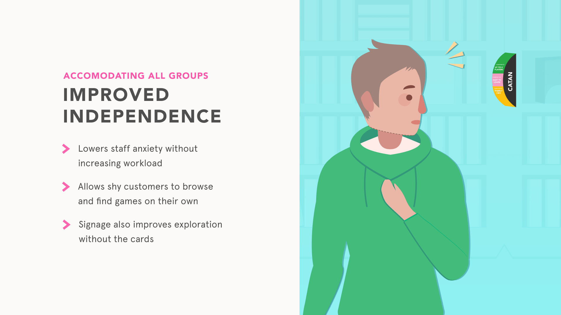
Choose Your Own Adventure aims to facilitate meaningful interaction between Rain City Games staff and customers who are new to board games. This playful card deck form-factor allows for self-sufficient in-store browsing through tailored board game recommendations, as well as highlighting staff’s extensive knowledge of board games.
Team
Ola Alsukour × Sahil Mann × Samyak Sah × Cameron Swanson

My Role
I was the art director, slide designer, illustrator, card designer, and supporting UX researcher. Working alongside Rain City Games' established branding, I was responsible for maintaining RCG's family-friendly image and create a cohesive and exciting story as we gained insight on this local board games shop.
research
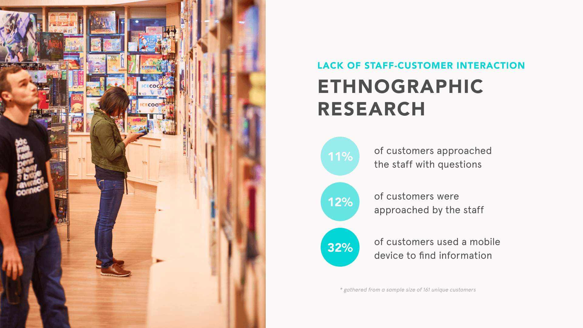
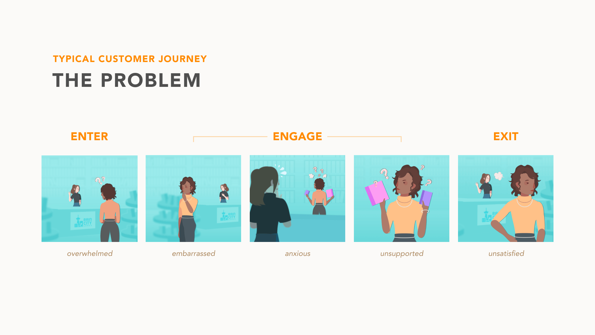
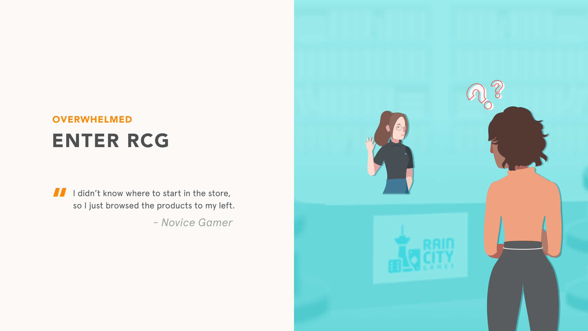
We analyzed core issues revolving around the brick and mortar store, discovering different methods to create a design concept that harmonized with Rain City Games' company goals. Our initial research involved fly-on-the-wall observations of customer behavior around the store.
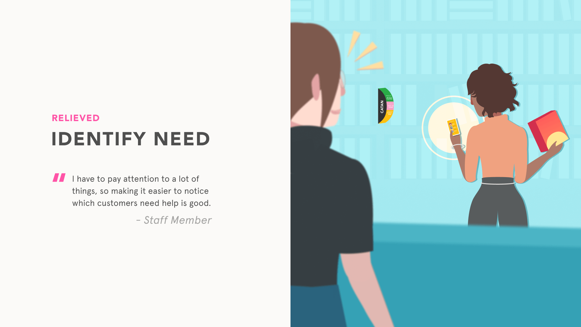
The team coordinated with store owners to get permission to speak with their customers, while I made observations from afar, taking note of various patterns of movement and body language.
Based on data gathered from our first few visits, we discussed the following areas:
- How might we invite more members to the board game community at RCG?
- How might we raise attendance at weekly in-house events?
challenges
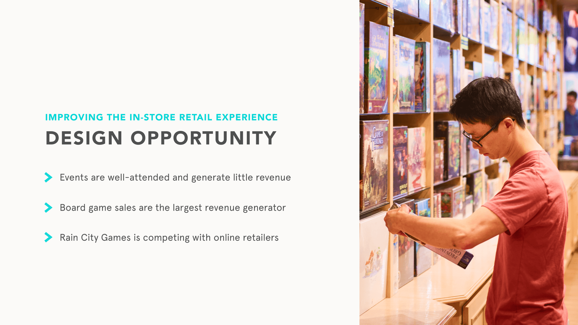
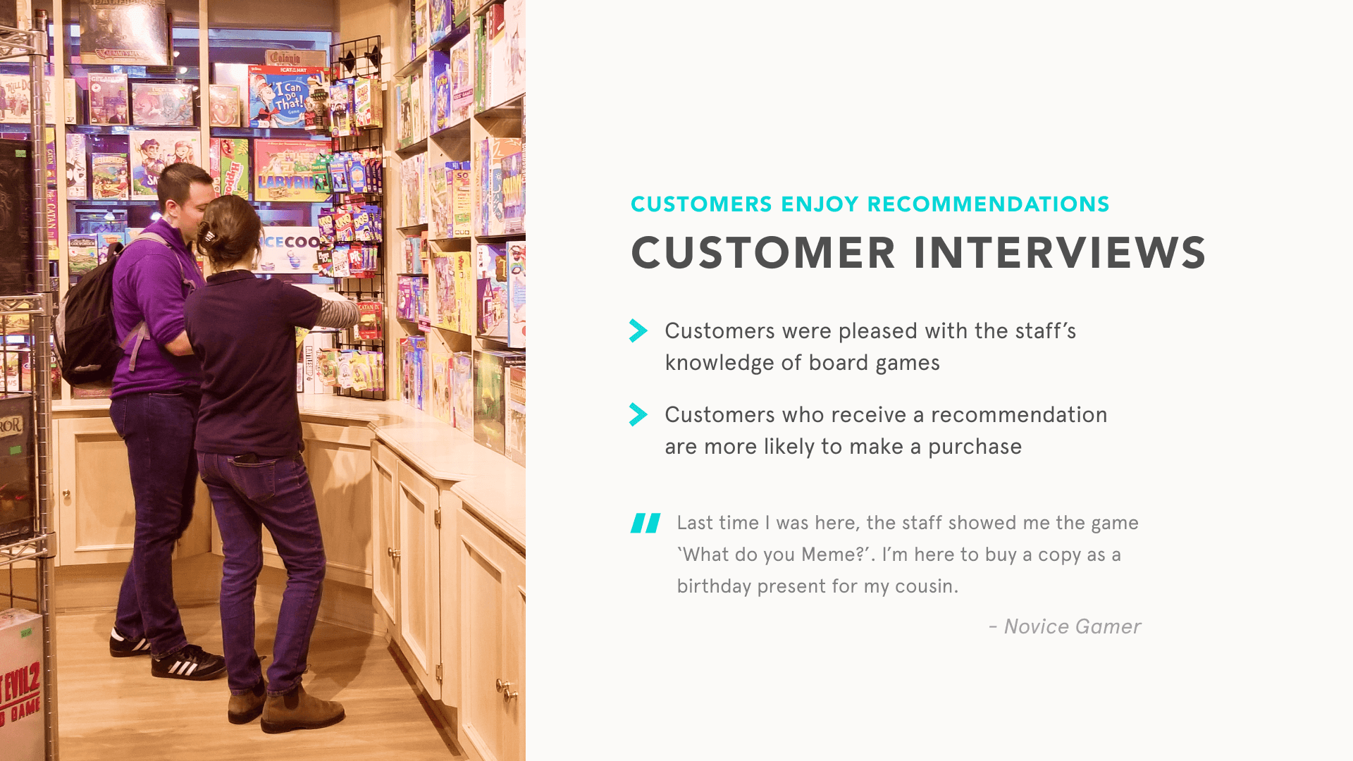
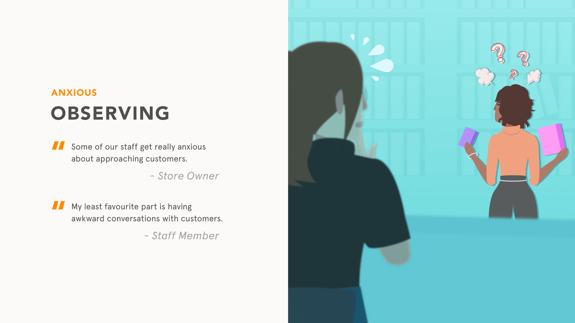
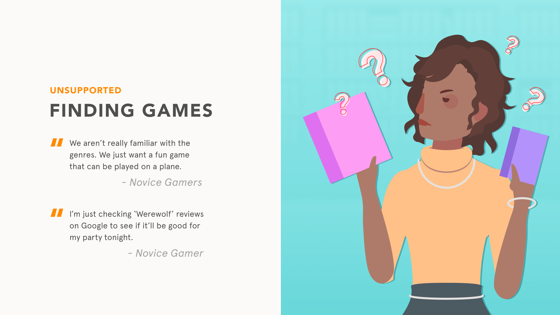
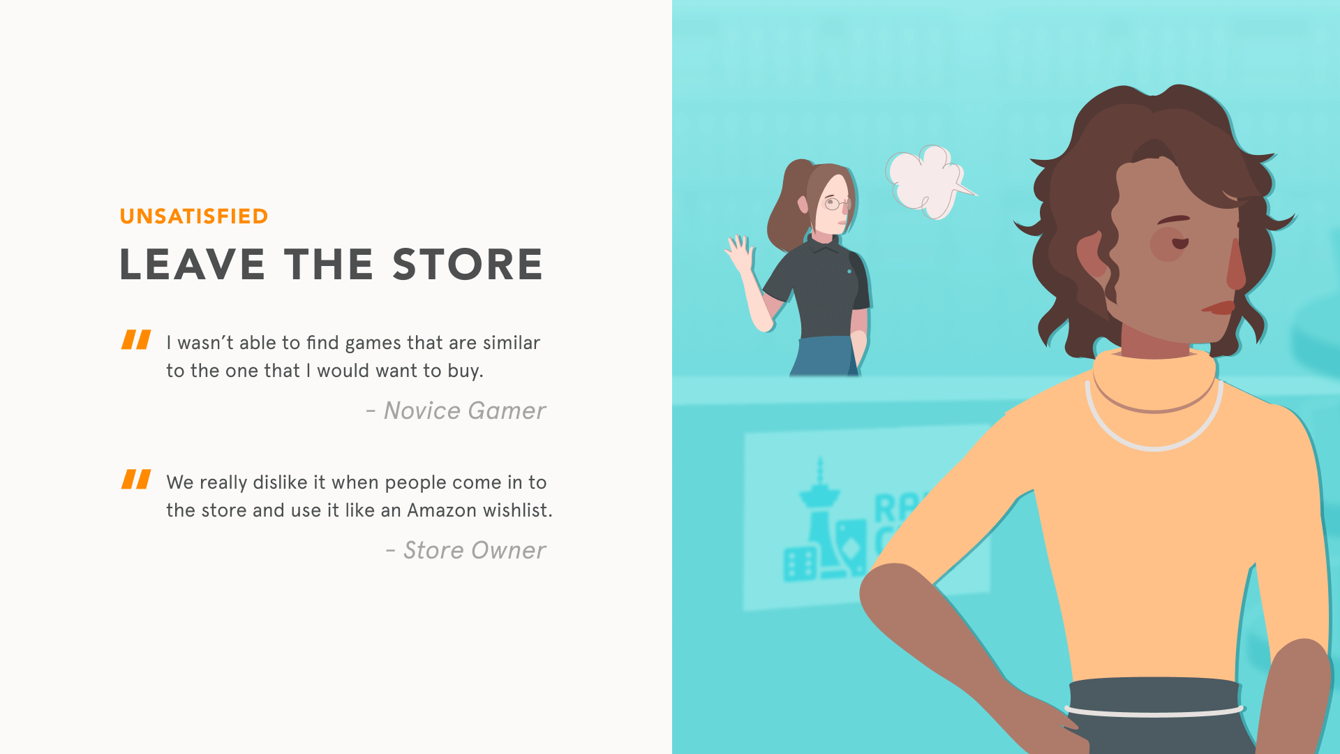
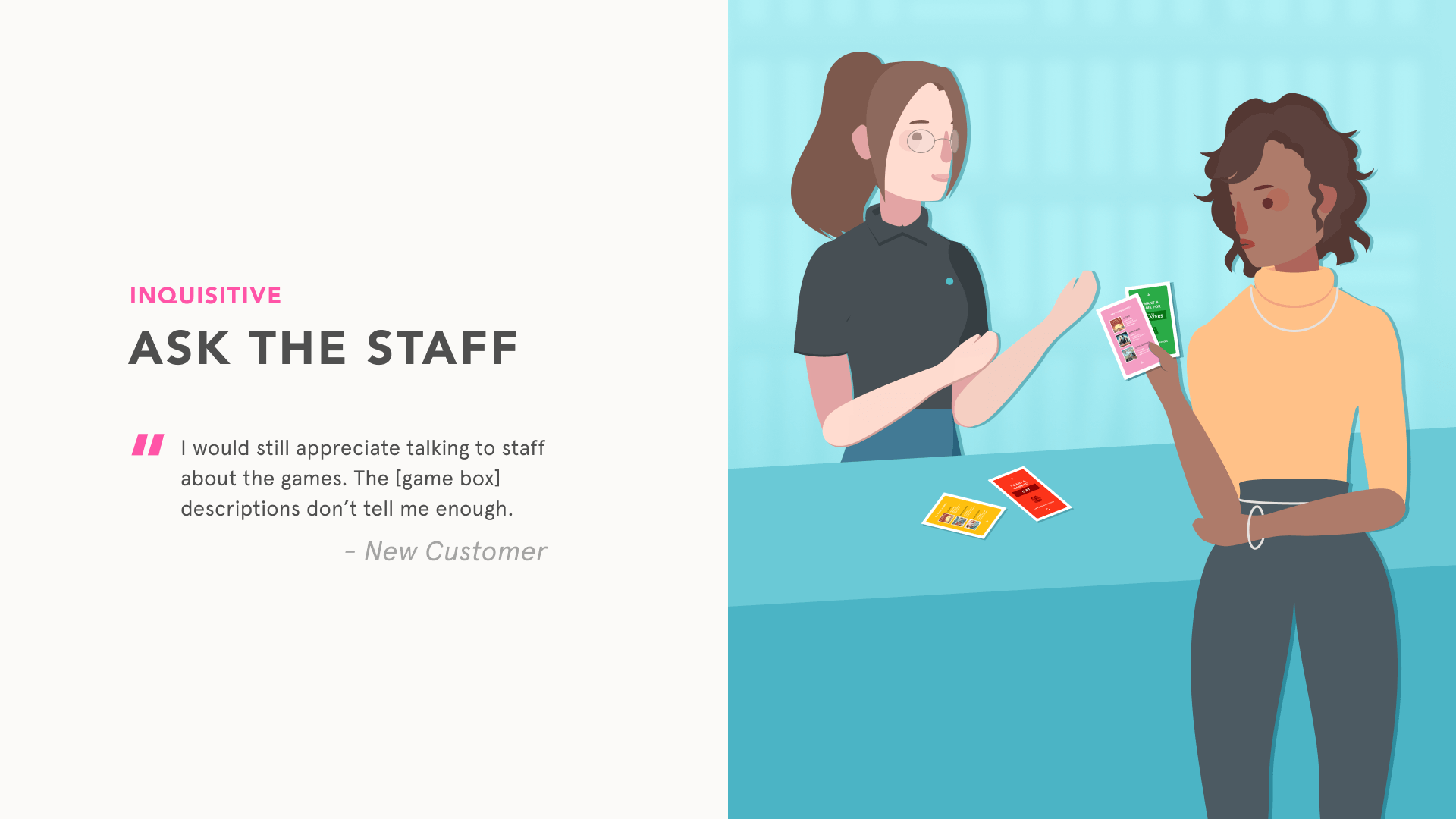
Despite community and events receiving the most traction for the shop, we opted to highlight the shop itself. This was the most viable option, as local board game specialty shops are rare in Vancouver. We further delved into staff-customer interactions, especially for those new or unfamiliar to board games.
In our dispersed interviews, we observed:
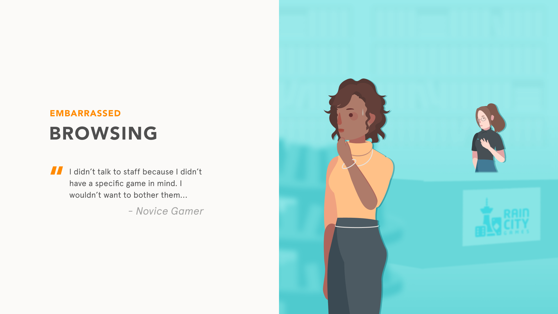
- Customers were reluctant to speak with staff
- Some customers were self-sufficient, and knew exactly what they were looking for
- Customers used the store to build an "Amazon wishlist", as they would prefer buying online rather than locally
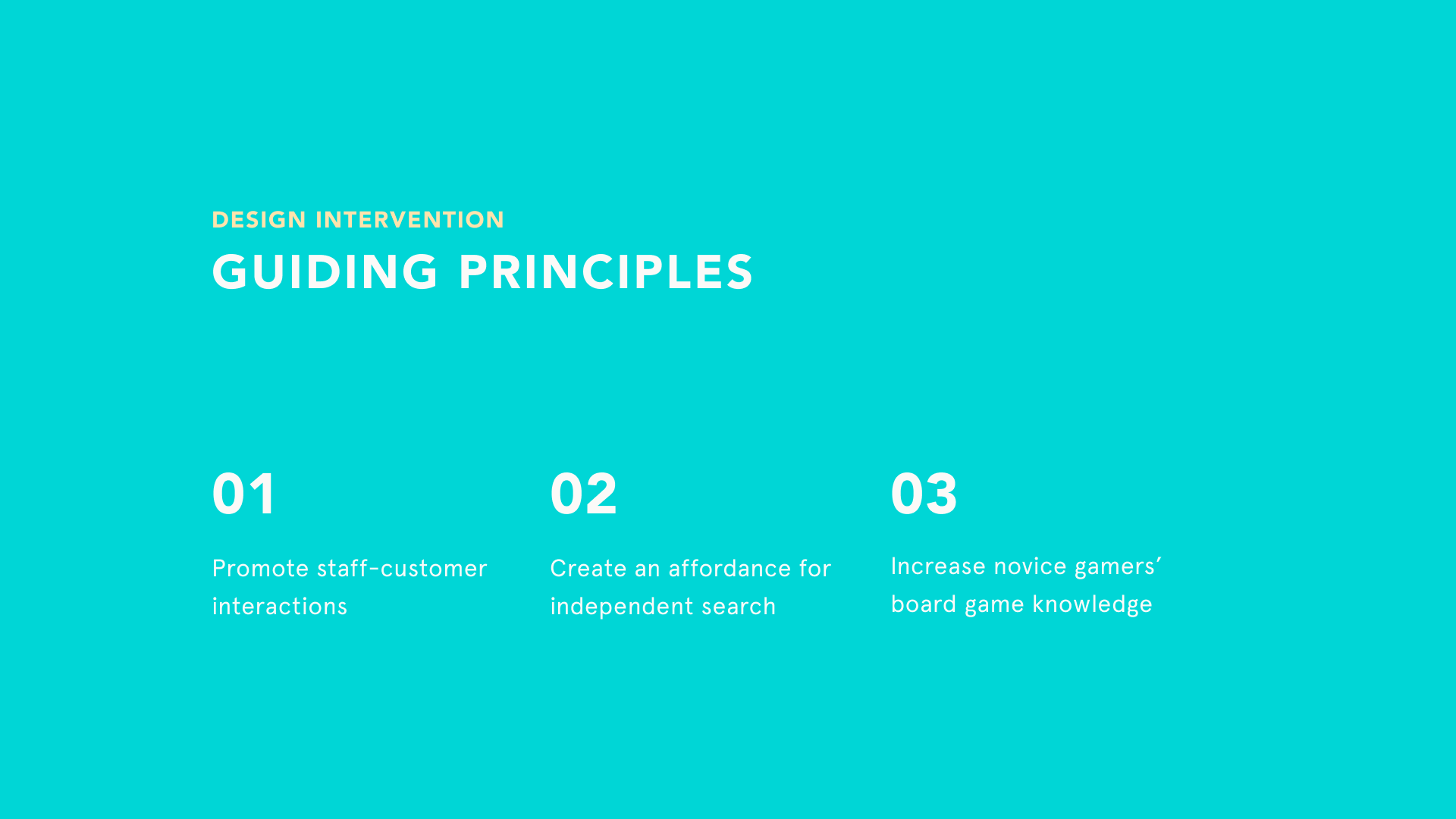
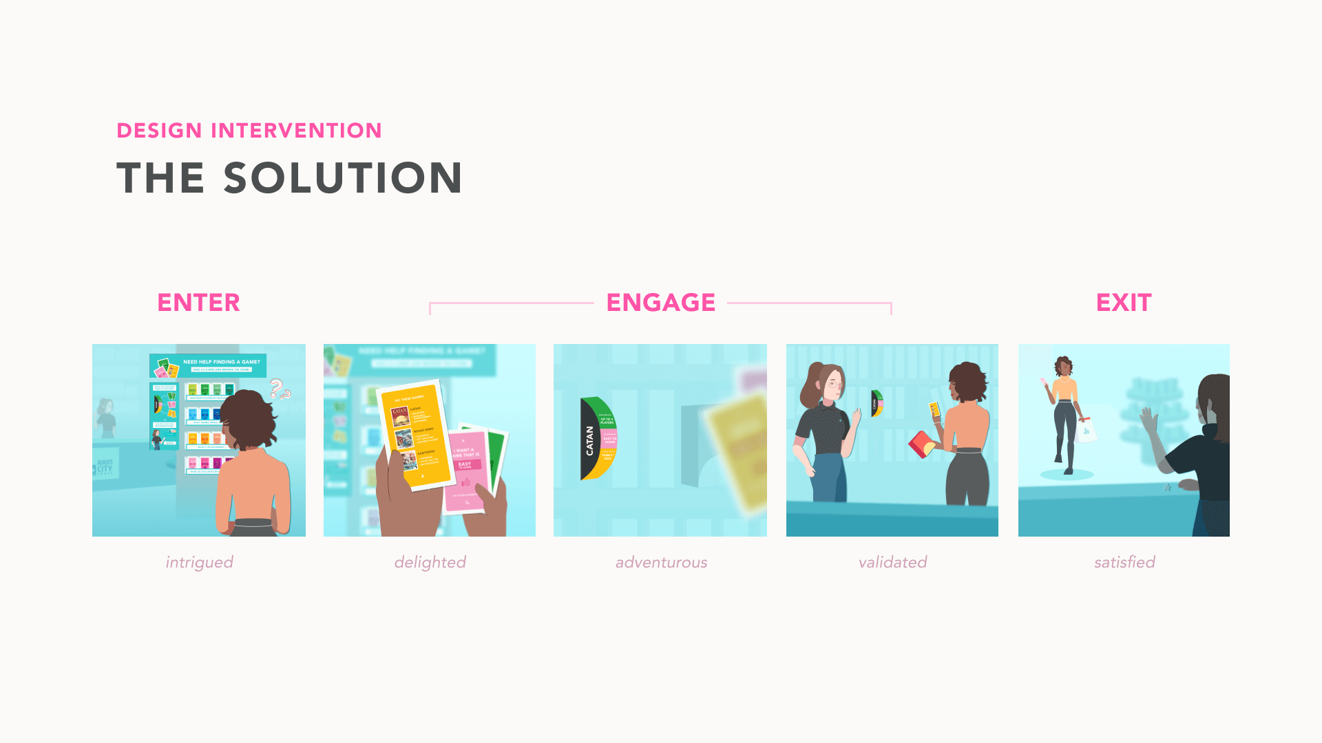
Our final solution sought to bring a playful mediation and facilitate a stronger relationship between customers and Rain City Games.
outcome
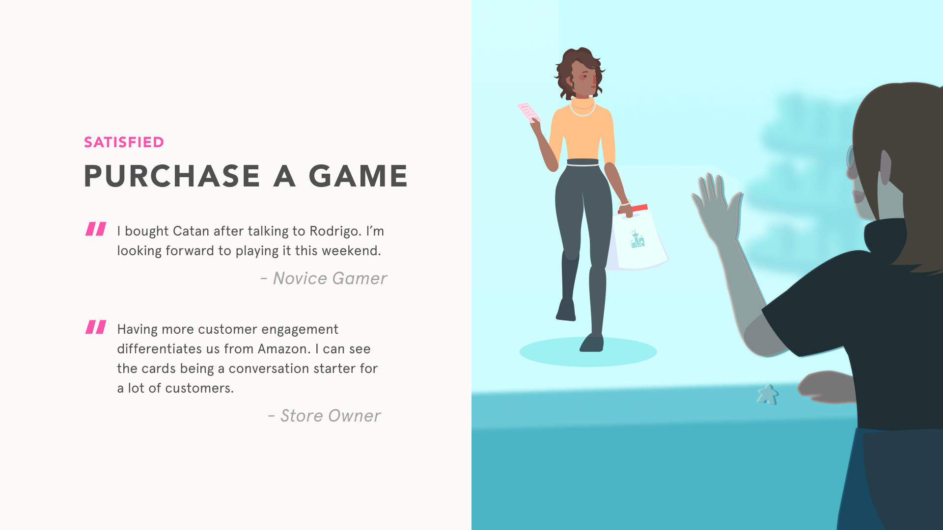
In order to distinguish the value of Rain City Games against online retailers like Amazon, we intended to make this a physical product-service hybrid instead of a digital app or interface. Our goal was to emphasize the importance of shopping locally in support of this niche community, while taking suggestions directly from its members.
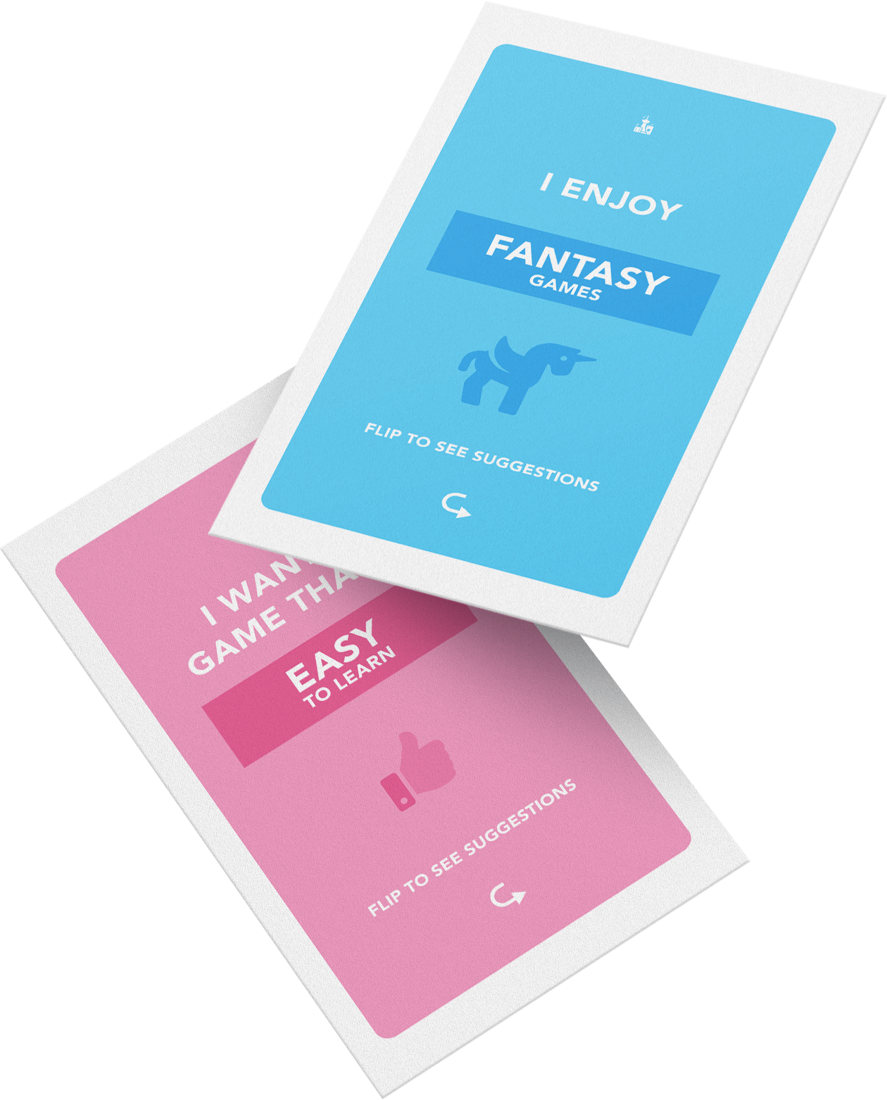
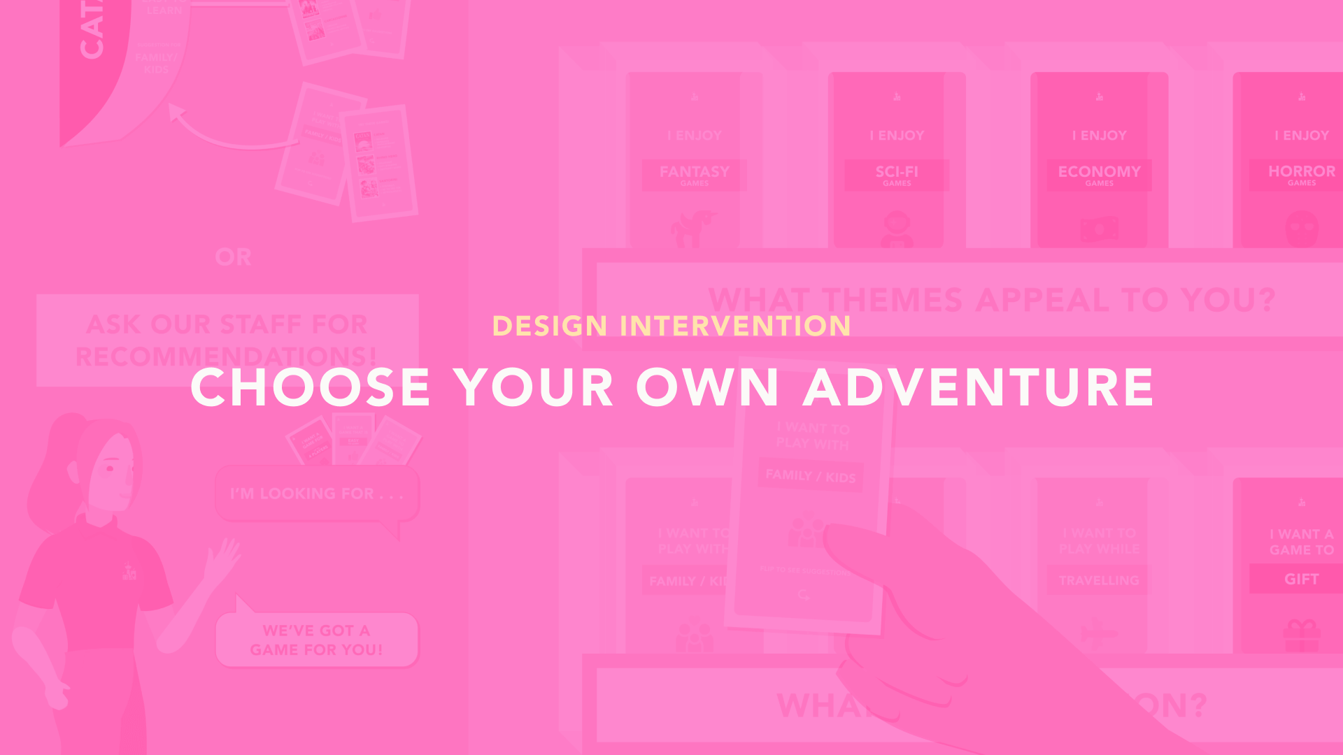
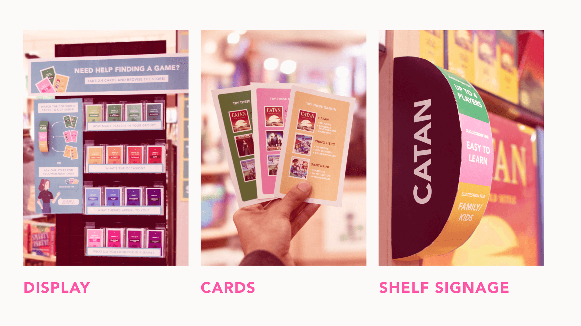
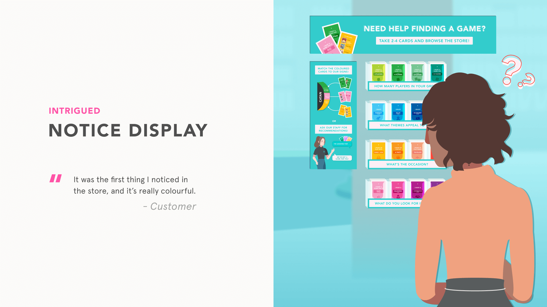
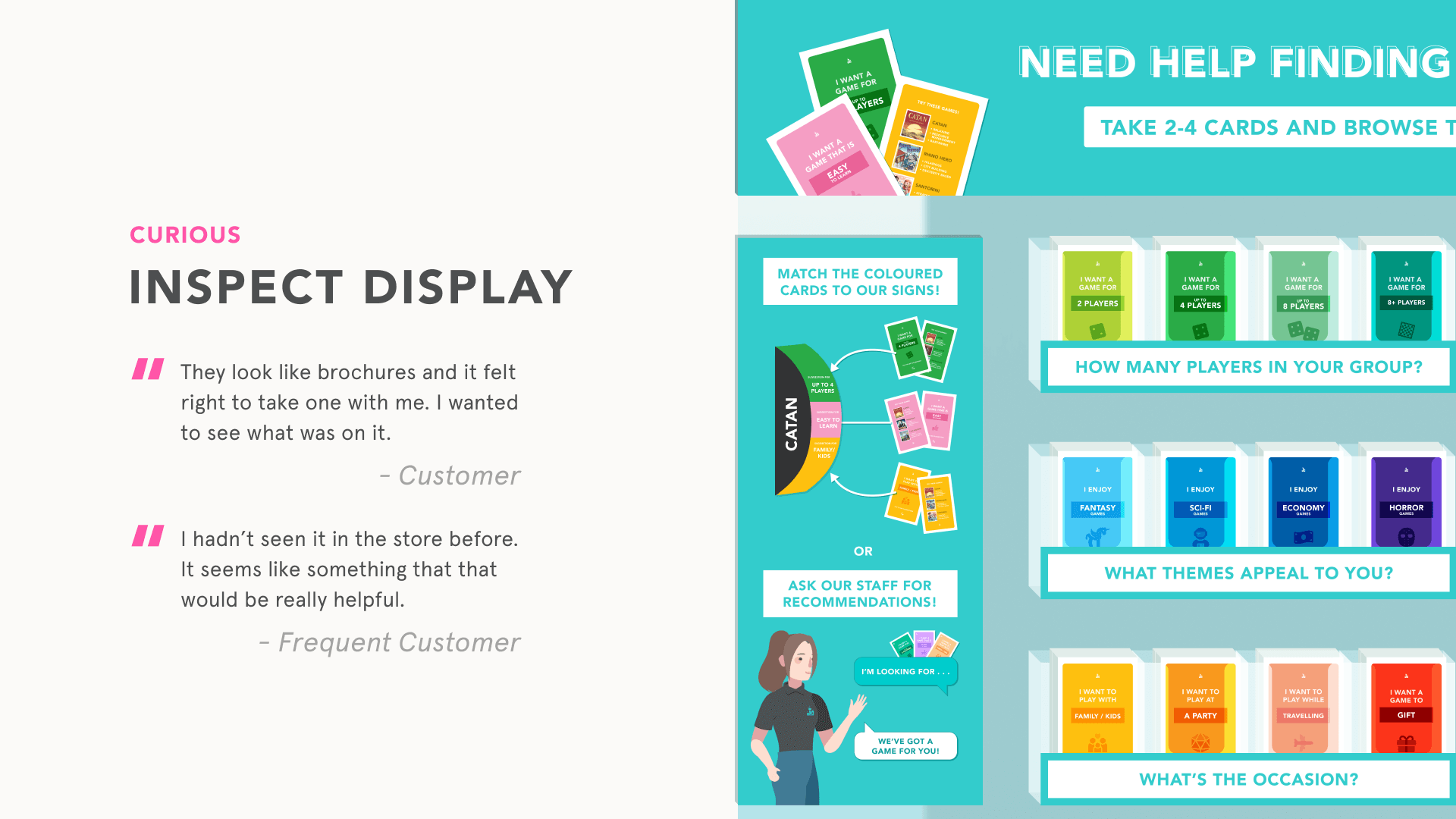
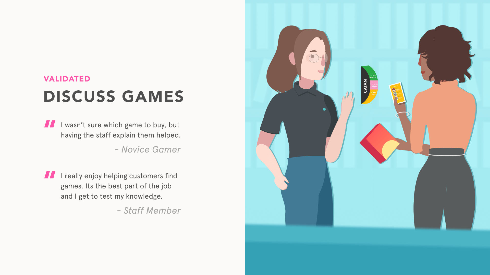
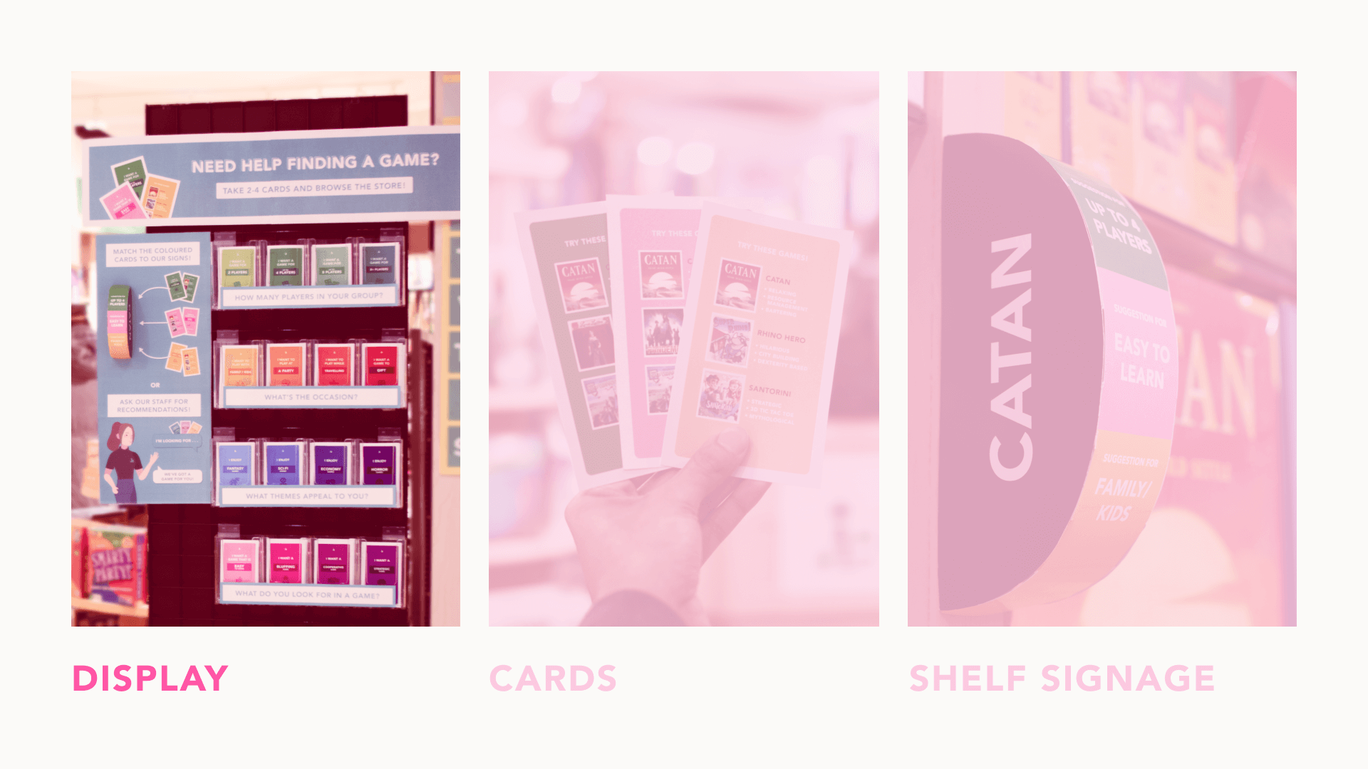
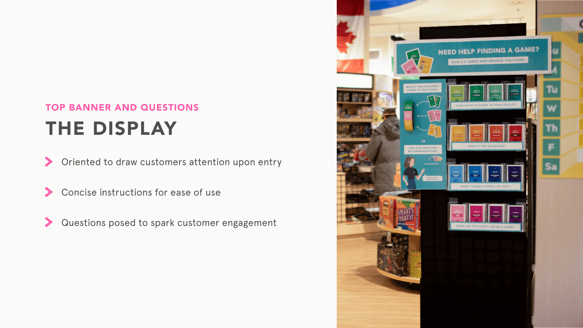
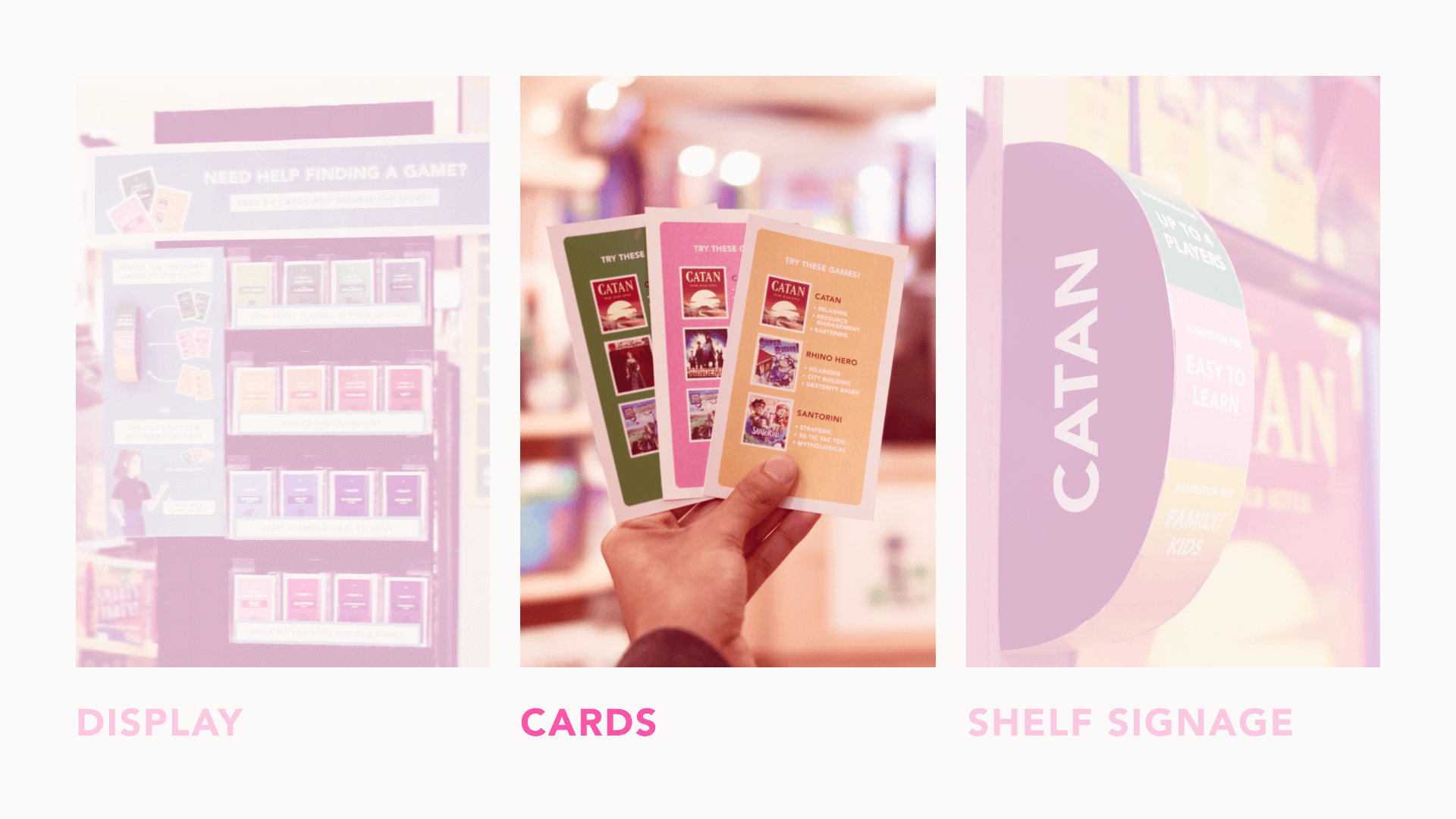
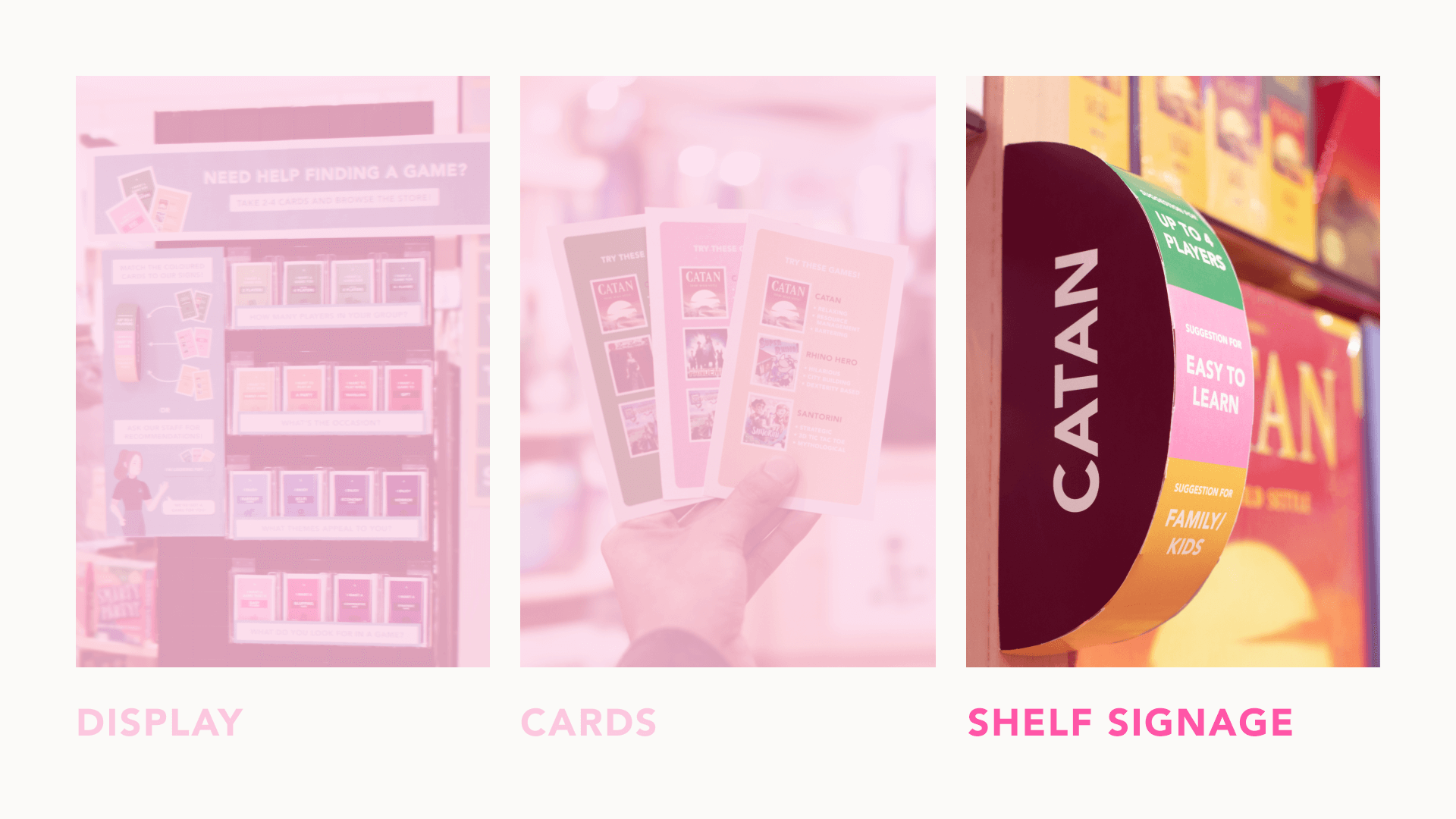
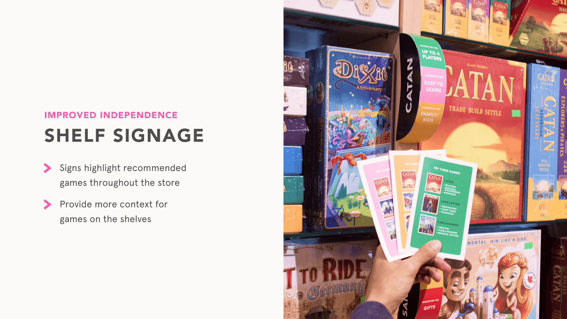
The result is a set of colorful prompt cards that lead Rain City Games' customers to subsequent shelf signage to find a game that they will enjoy in the store.
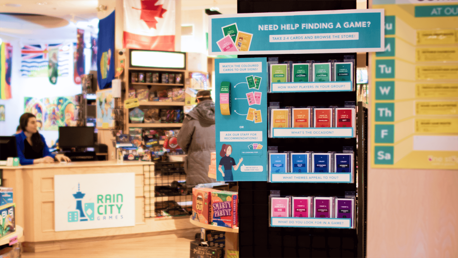
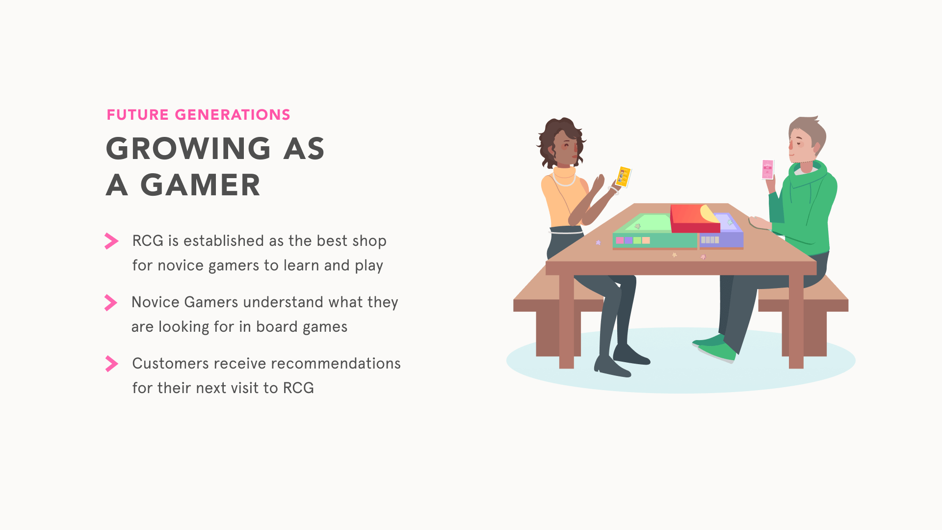
This design creates a strong value proposition between staff and (prospective) customers, namely new or novice board gamers, to return to Rain City Games for staff's knowledge of tailored recommendations, making the store a more personalized and genuine option over online retailers.
features
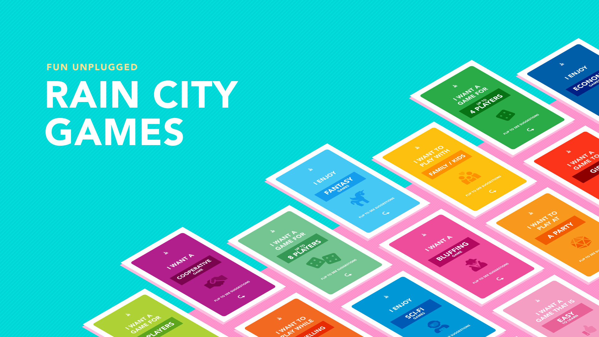
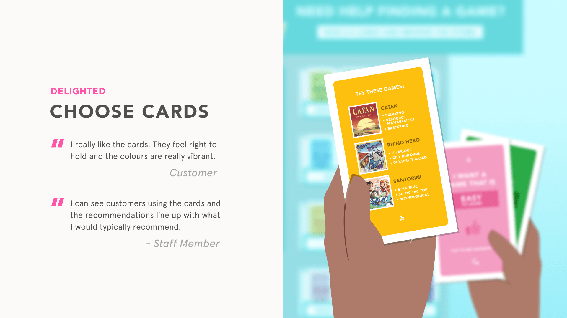
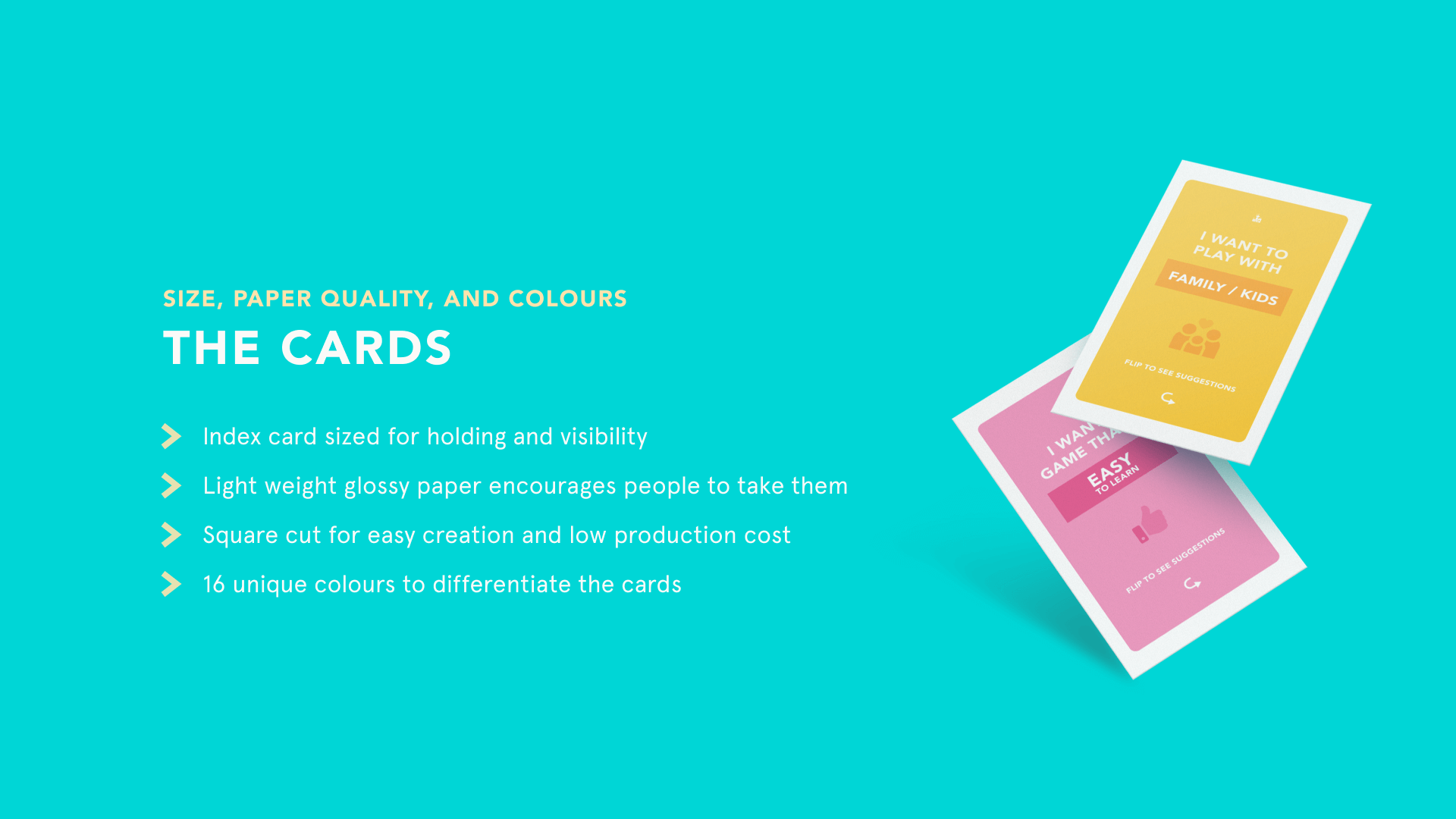
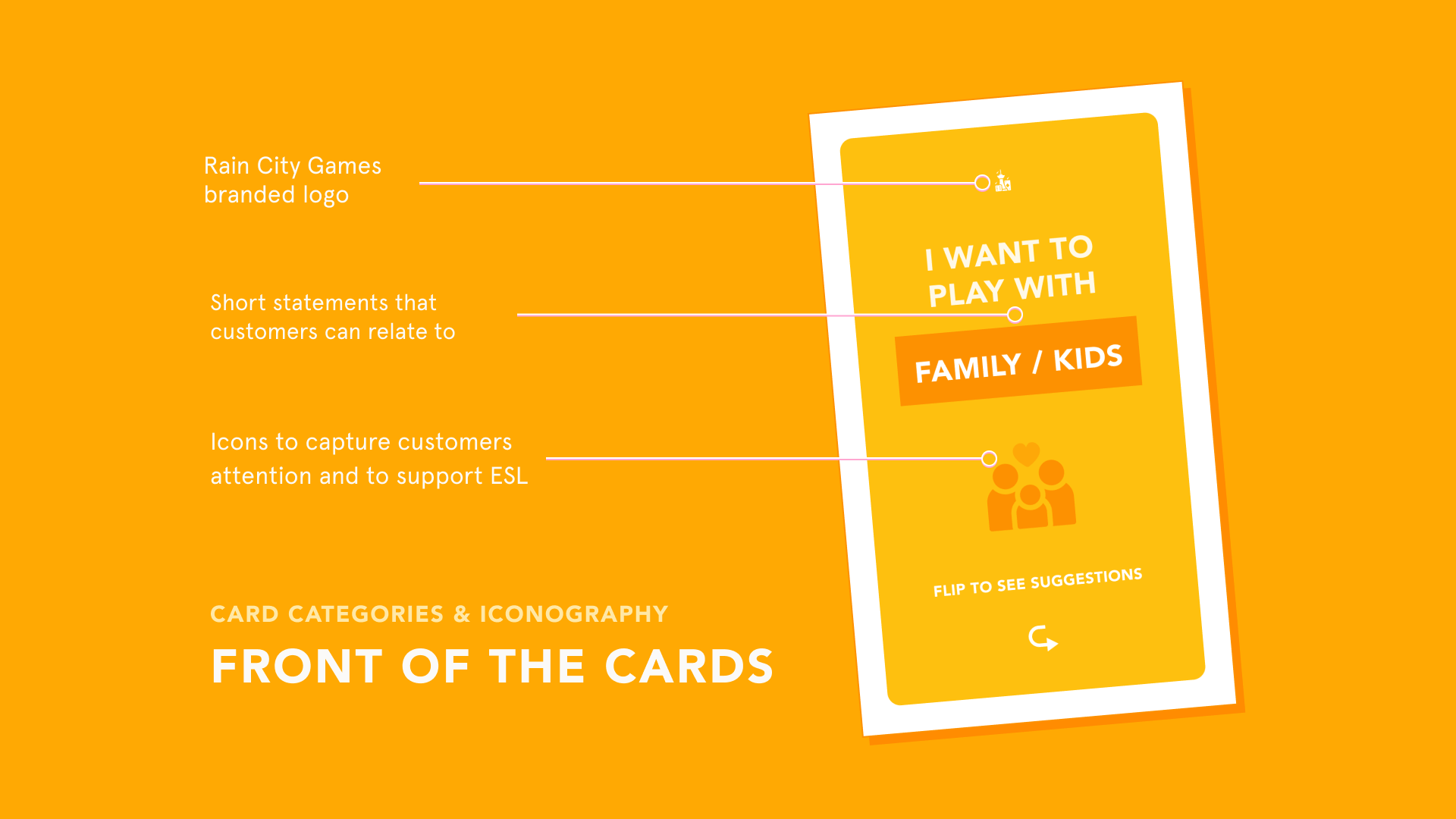
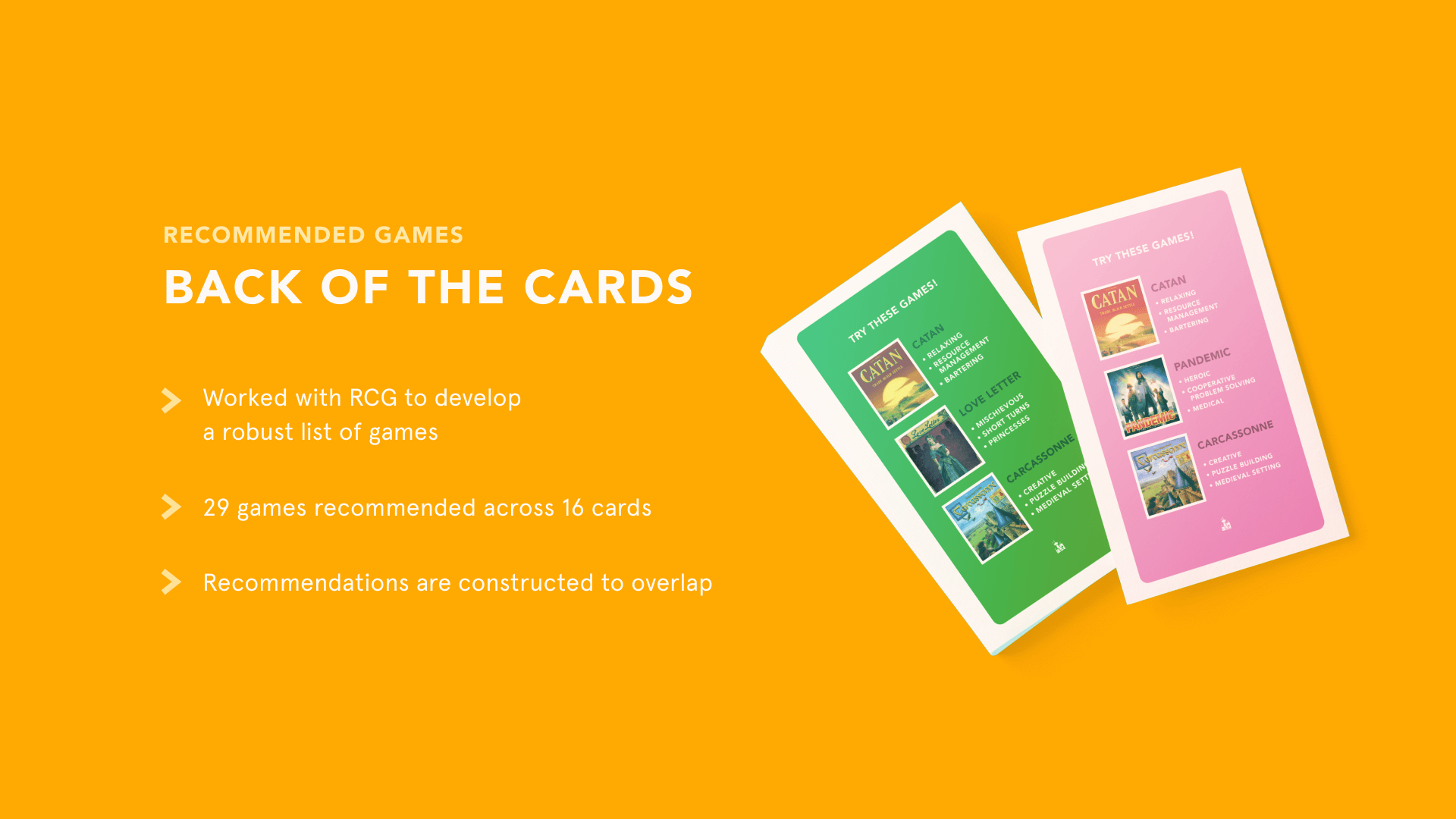
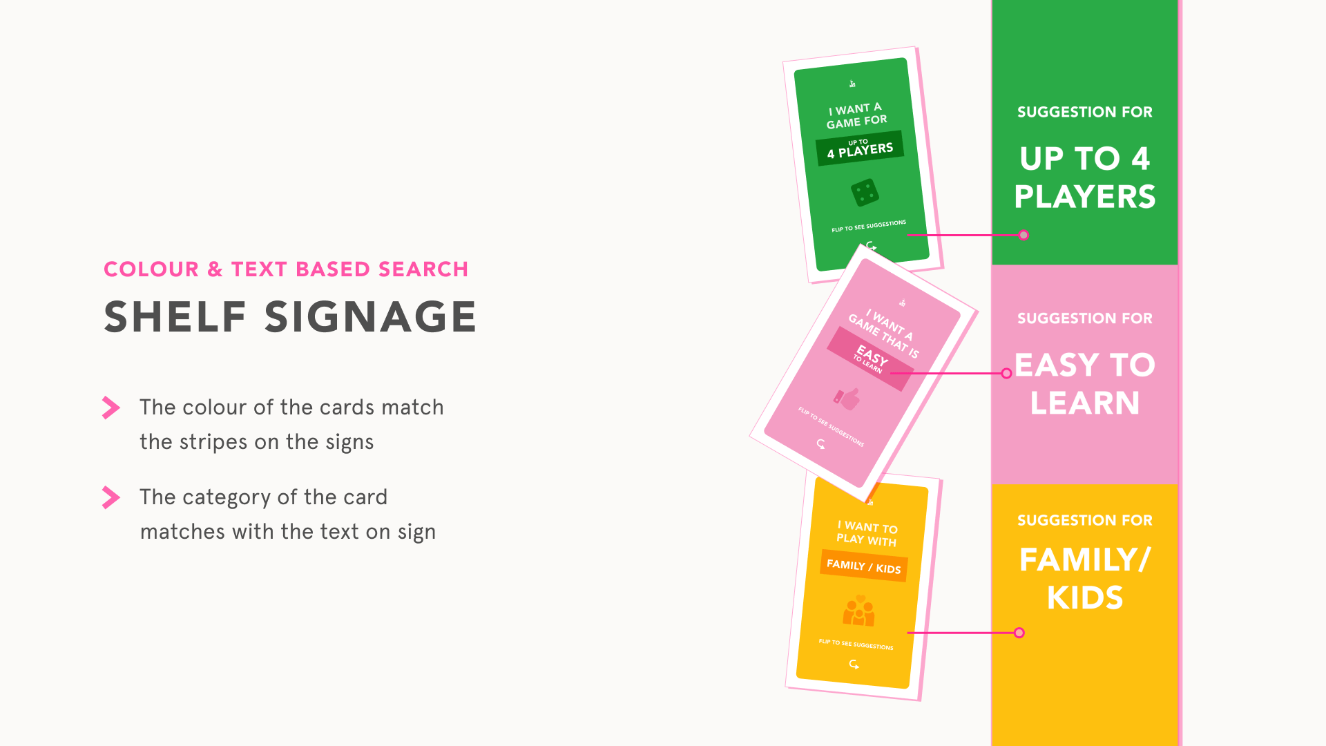
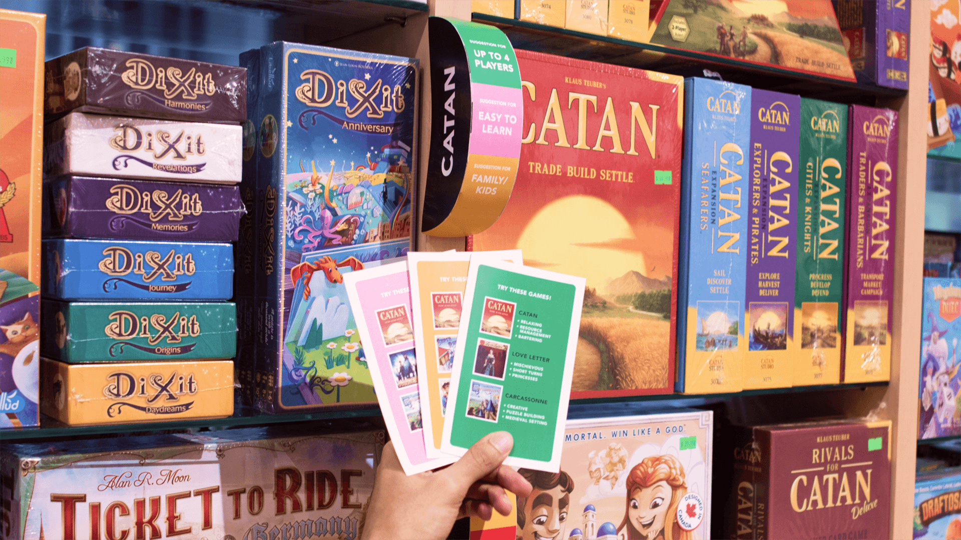
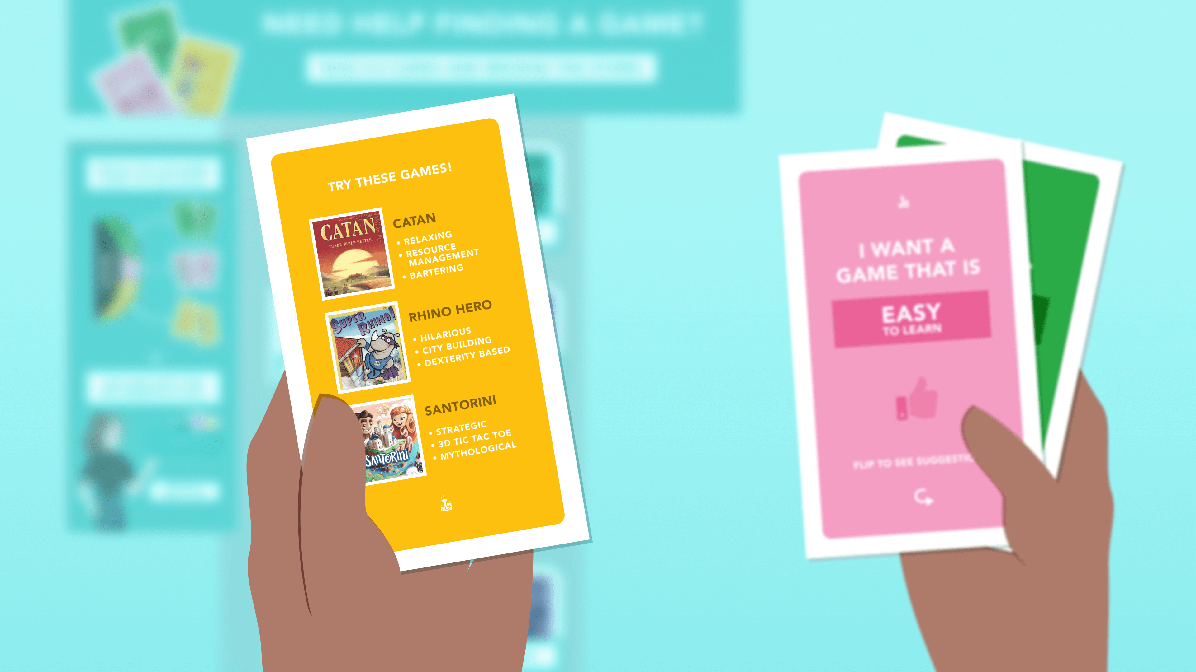
Cards are printed on two-sided 4 x 6 semi-glossy light weight cardstock paper, in 16 different shades and 4 color categories for visceral interest and grouping. I was responsible for deciding each card color, cross-checking the CMYK output through test prints of the color groups. I designed the layout for both sides of the cards.
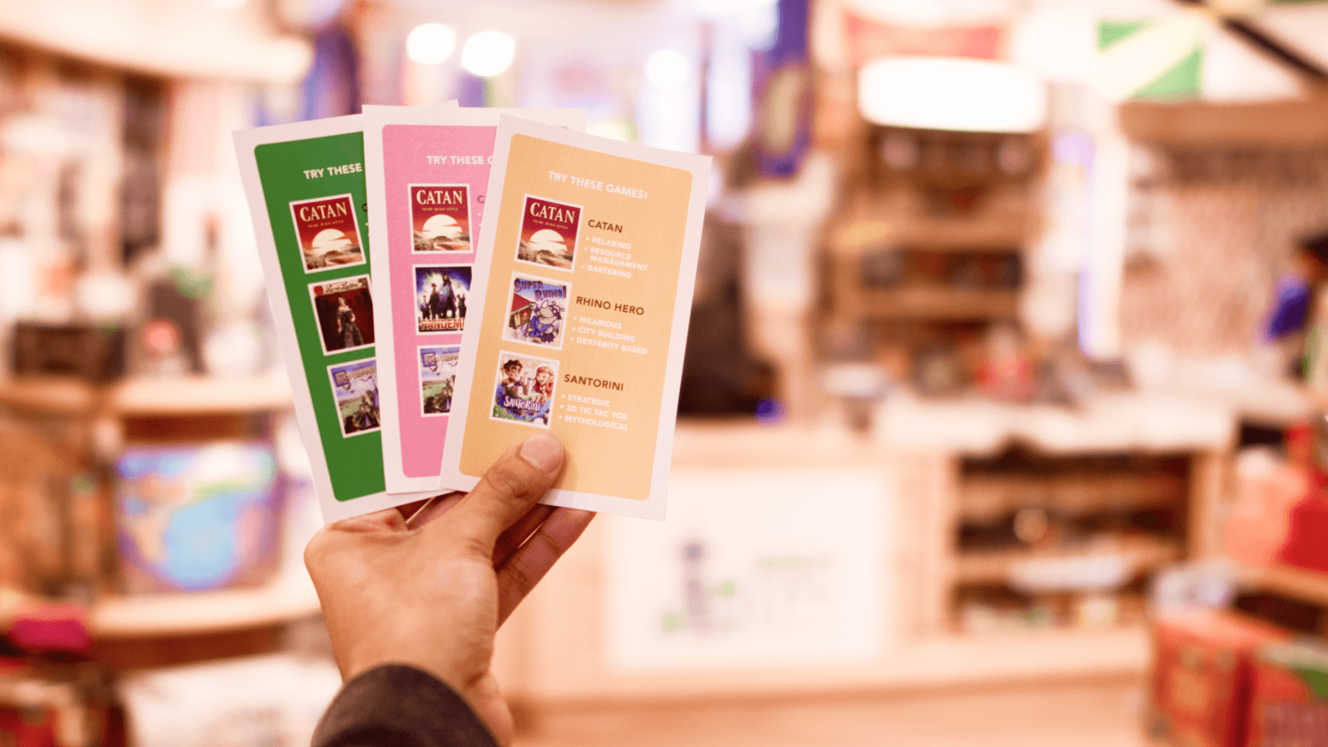
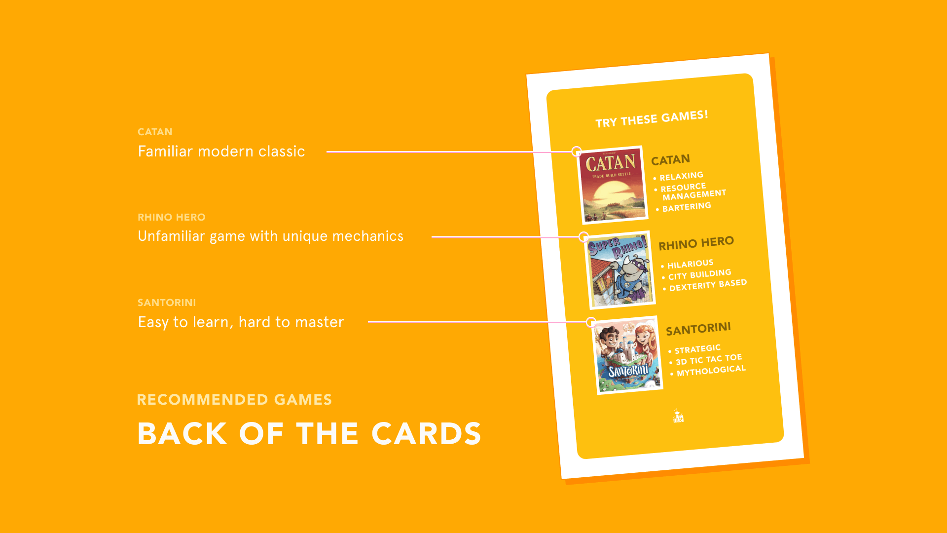
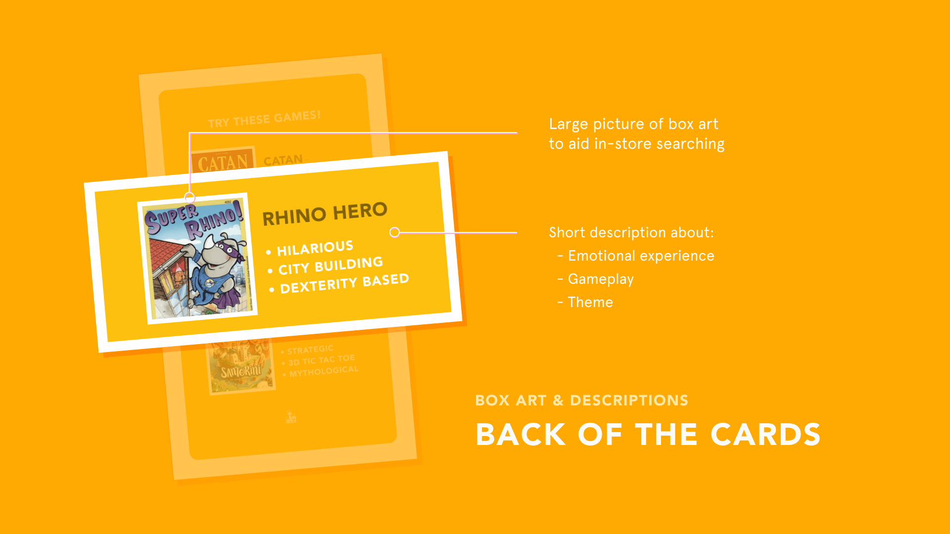
The front side reads a prompt for game recommendations which a customer may be interested in- from "I Want a Game for 2 Players" to "I want to Play at a Party". The flip side shows a list of 3 games with a quick run-down of what each game entails: similar games or playstyles, the general mood or emotion of the gameplay, and theme of the game. These games come directly from the owner of Rain City Games' "Evergreen Games" List, meaning these games are popular and consistently sought after.
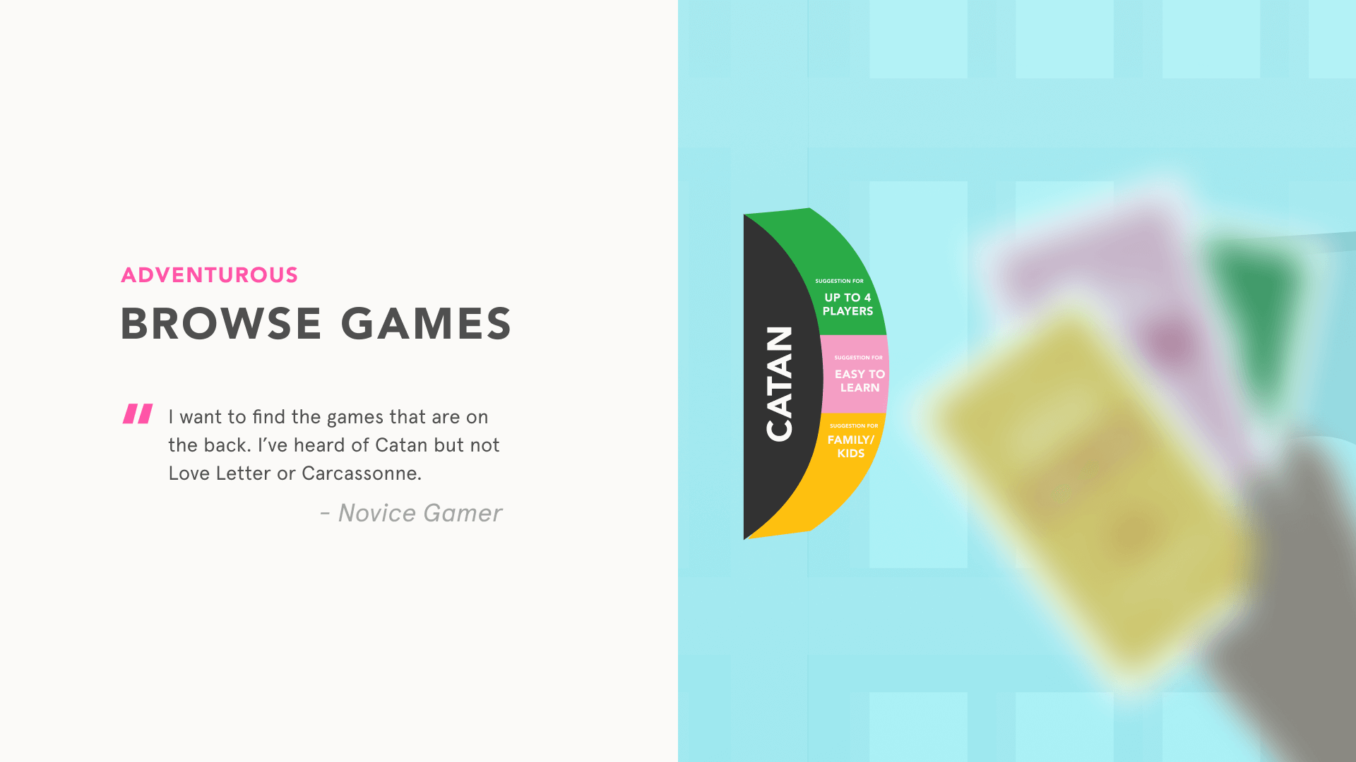
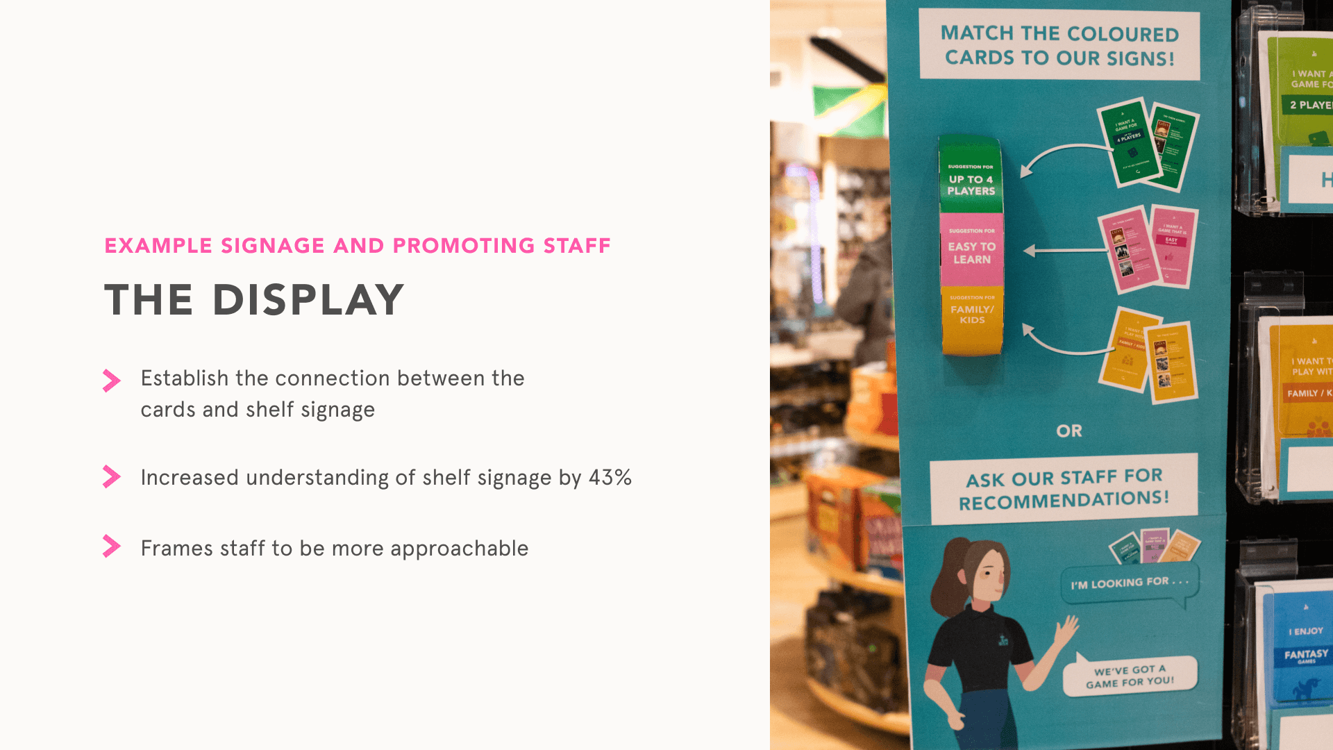
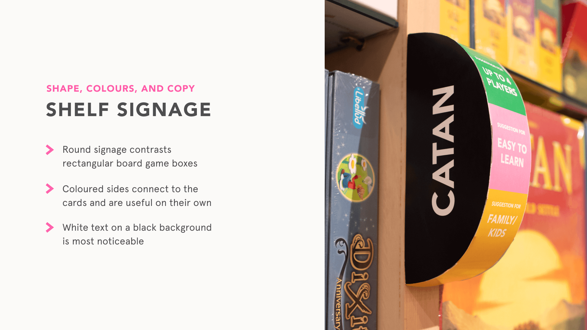
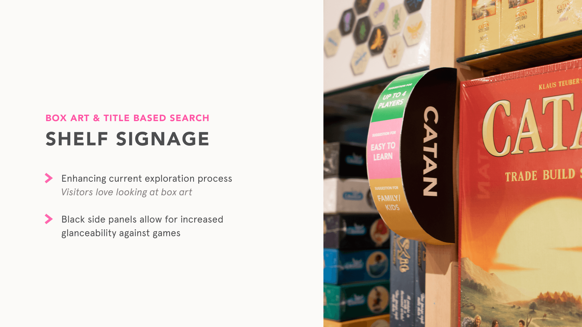
Shelf signage is printed on laminated cardstock for high visibility and cohesive finish against the store's wood shelves. Card colors correspond to shelf signage dispersed across the store, adjacent to the box it is labelled as. Visual learners are especially adept in picking up with the color correlation between cards and shelf signs. Some games belong to more than one category, so there are up to three colors per one shelf sign, divided across the rounded side.
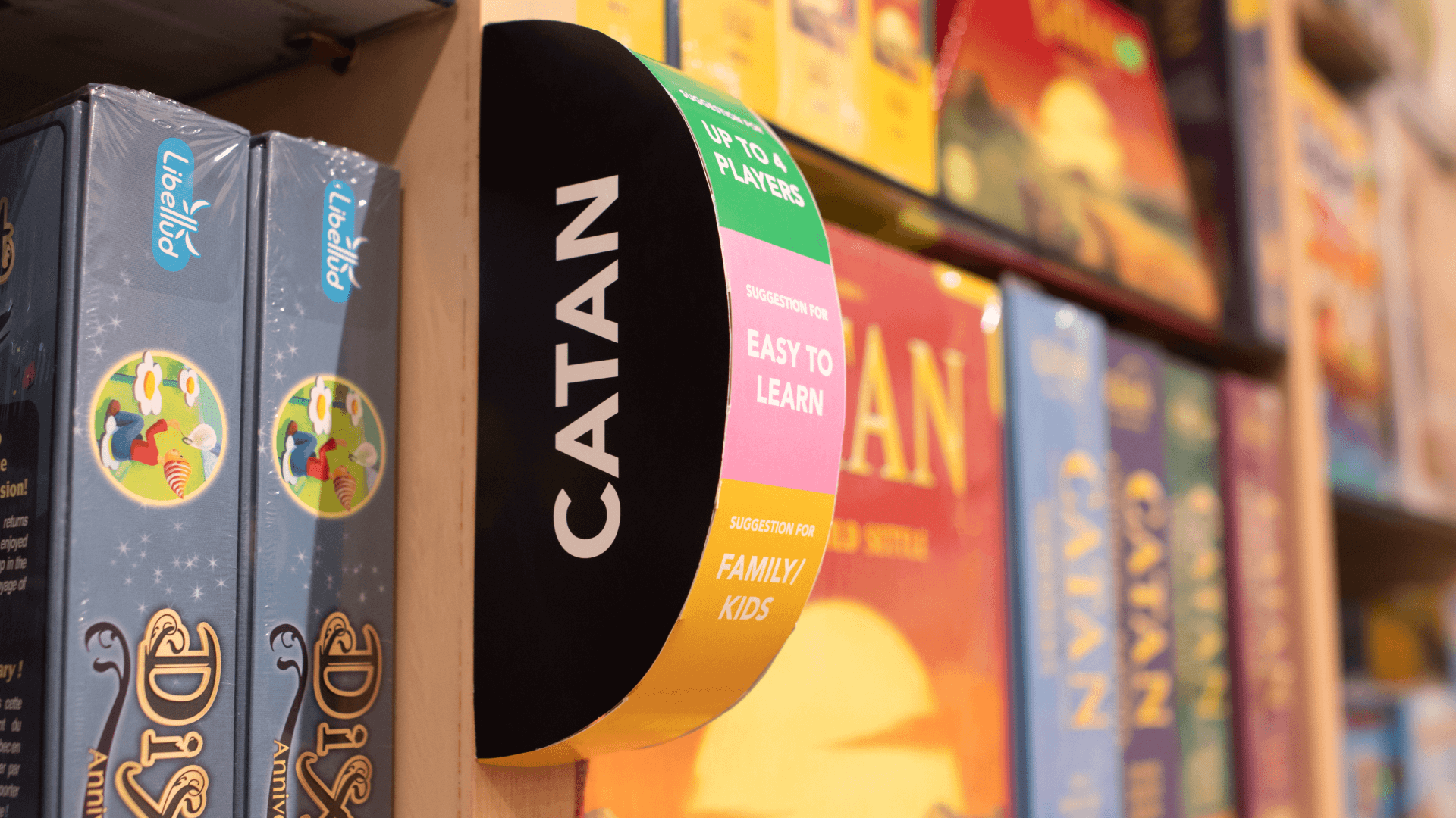
The form of this signage is meant to catch the attention of customers browsing parallel to the shelves, where the white-text on black background sits on the flat side of the half-cylinder. Even the edge of the front rounded-side can be seen from different angles, so customers are able to find the colors they seek based on card categories. In case they are unsure of the color categories, they are also labelled appropriately: For example, "Suggestion for Up to 4 Players".